Progress bar
A progress card for footage: an icon, what is happening, a striped bar filling with the percentage counting up, then a check and the done line when it reaches the end.
essentials/progress-bar- Essentials
- timer
- Overlay with alpha
- 5 s (2–30 s)
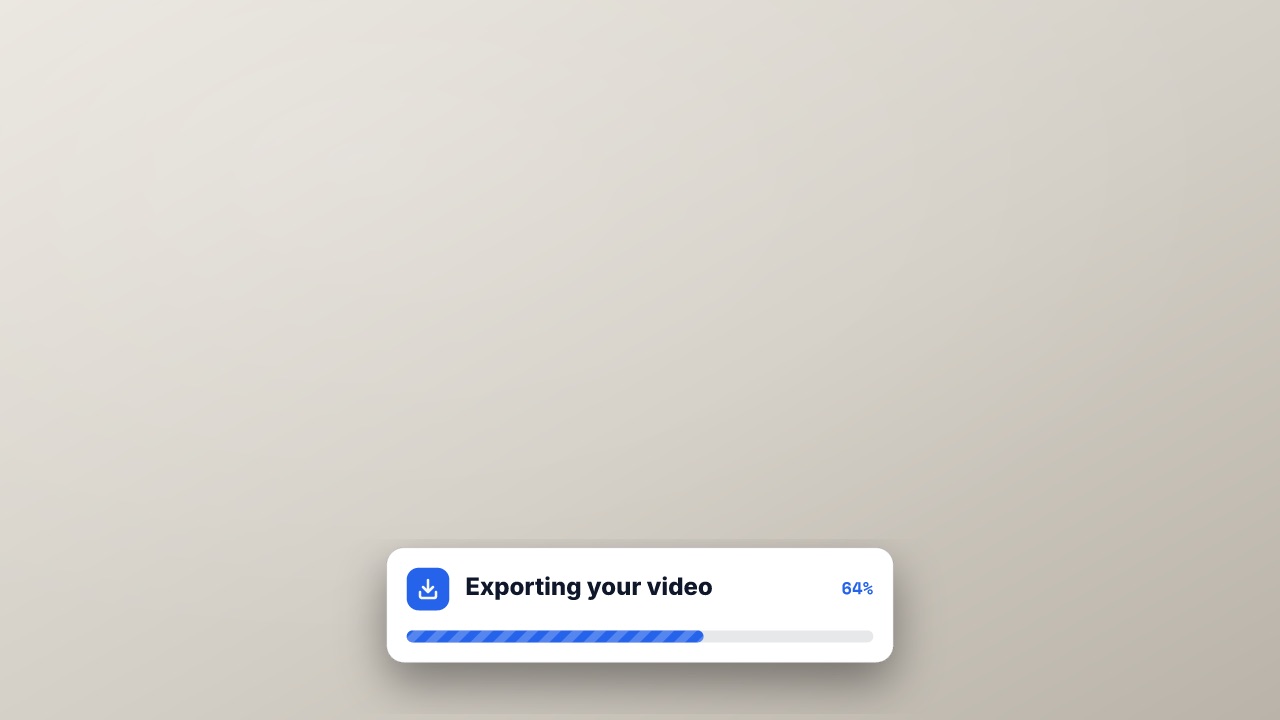
npx volito render essentials/progress-bar --style studio --out progress-bar.movRender it
npx volito render essentials/progress-bar --prop label="Exporting your video" --prop done="Ready to post" --out progress-bar.movThat writes ProRes 4444 with alpha, ready to drop over footage. The same item in another shape, brand or format:
volito render essentials/progress-bar --aspect 9:16 --style cobalt --out progress-bar-9x16.mov
volito render essentials/progress-bar --format mp4 --out progress-bar.mp4
volito still essentials/progress-bar --t 2.5 --out progress-bar.png
volito info essentials/progress-bar     # every prop and part
volito add essentials/progress-bar # copy its source into ./motion to editFrom Node:
import { findItem, renderVideo } from "volito";

await renderVideo(findItem("essentials/progress-bar"), { props: { label: "Exporting your video", done: "Ready to post" }, out: "progress-bar.mov" });Or ask an agent with the MCP server connected: “Render the Volito progress bar (essentials/progress-bar) in 9:16, in our brand.”
Props
Set each with --prop name=value, or all at once with --props and a JSON object.
| Prop | Type | Default | Takes |
|---|---|---|---|
label | text | Exporting your video | ≤ 40 chars |
valueReaches (%) | number | 100 | 0 – 100 |
doneDone line | text | Ready to post | ≤ 40 chars |
icon | icon | download | — |
position | choice | bottom | bottom | center | top |
Parts
Each part takes any move, ease or idle: --motion card.in=pop.
| Part | What it is |
|---|---|
card | the card |
More in Essentials
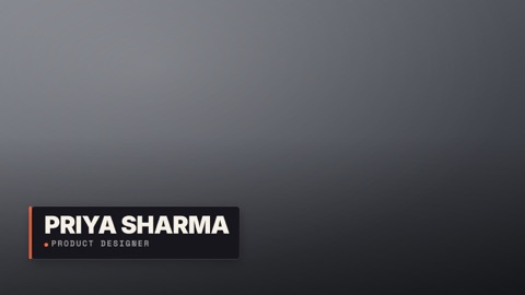
Lower third
A name plate over footage: an accent spine grows, the plate wipes in, the name rises, the role slides in.
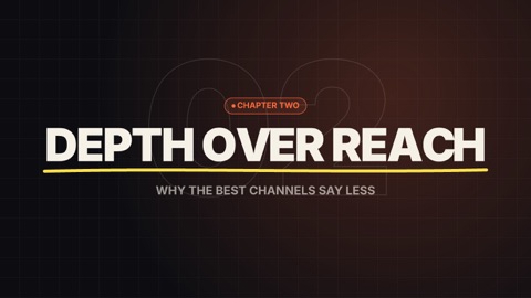
Title card
A full-frame chapter or opening title: a kicker chip, the title built letter by letter, a brush underline, a subtitle — over the brand's ground with an outlined number drifting behind.
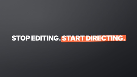
Kinetic headline
Big words that pop in one by one — on the voice when you give it a transcript — with a marker swiped under the *starred* words.

Subscribe
A call to action over footage: the channel card springs in, a cursor glides onto the button and presses it, the bell rings.
Social handle
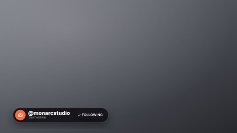
Your handle in a corner: a pill with the platform's icon slides in, a follow button presses, it tucks away.
Callout
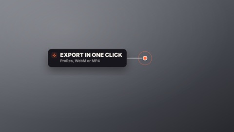
Points at something in the shot: a ring pulses on the spot, a line draws out to a label card that pops in beside it.