Follow card
A profile card: picture or initials, name with a verified check, handle, a follower count that counts up, a line of bio and a Follow button a cursor presses.
social/follow-card- Social
- social
- Overlay with alpha
- 5 s (3–30 s)

Render it
npx volito render social/follow-card --prop name="MONARC Studio" --prop handle="@monarcstudio" --out follow-card.movThat writes ProRes 4444 with alpha, ready to drop over footage. The same item in another shape, brand or format:
volito render social/follow-card --aspect 9:16 --style cobalt --out follow-card-9x16.mov
volito render social/follow-card --format mp4 --out follow-card.mp4
volito still social/follow-card --t 2.5 --out follow-card.png
volito info social/follow-card     # every prop and part
volito add social/follow-card # copy its source into ./motion to editFrom Node:
import { findItem, renderVideo } from "volito";

await renderVideo(findItem("social/follow-card"), { props: { name: "MONARC Studio", handle: "@monarcstudio" }, out: "follow-card.mov" });Or ask an agent with the MCP server connected: “Render the Volito follow card (social/follow-card) in 9:16, in our brand.”
Props
Set each with --prop name=value, or all at once with --props and a JSON object.
| Prop | Type | Default | Takes |
|---|---|---|---|
name | text | MONARC Studio | ≤ 26 chars |
handle | text | @monarcstudio | ≤ 28 chars |
followers | number | 248000 | 0 – 999999999 |
bio | text | Edits that feel directed, not assembled. | ≤ 60 chars |
platform | choice | instagram | tiktok | youtube | x | linkedin | threads | website | |
photo | image | — | — |
verified | boolean | true | — |
actionButton | text | Follow | ≤ 14 chars |
doneButton after | text | Following | ≤ 14 chars |
position | choice | auto | auto | center | bottom-left | bottom-right |
Parts
Each part takes any move, ease or idle: --motion card.in=pop.
| Part | What it is |
|---|---|
card | the card |
avatar | the picture |
name | the name and handle |
stats | the follower count |
bio | the bio |
button | the button |
cursor | the cursor |
More in Social
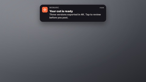
Notification
A phone or desktop notification slides in: the app's icon and name, the time, a bold title and the message.
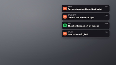
Notification stack
Notifications land one after another and stack up, each new one pushing the pile down.
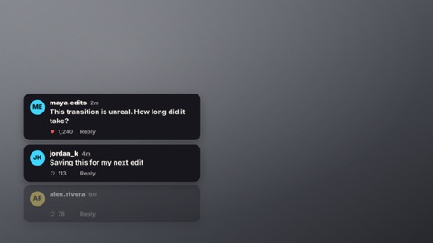
Comments
Comment cards appear one by one: a picture or initials, the name, the time, the words typing on and a like count.
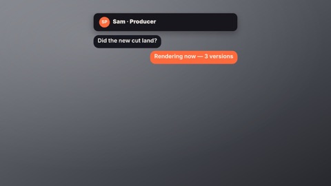
Chat thread
A message thread plays out: their bubbles arrive after a typing indicator, yours on the right in the accent.
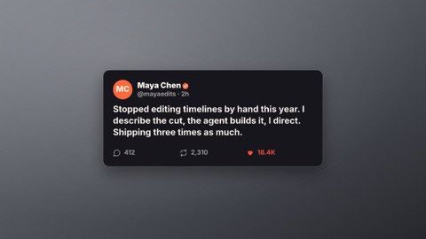
Social post
A post card: picture or initials, name, handle and check, the words, and likes, reposts and replies counting up as a heart pops.

Now playing
A music card: the cover (or a generated one), the title and artist, a progress bar moving with the clip and an equaliser.