Like
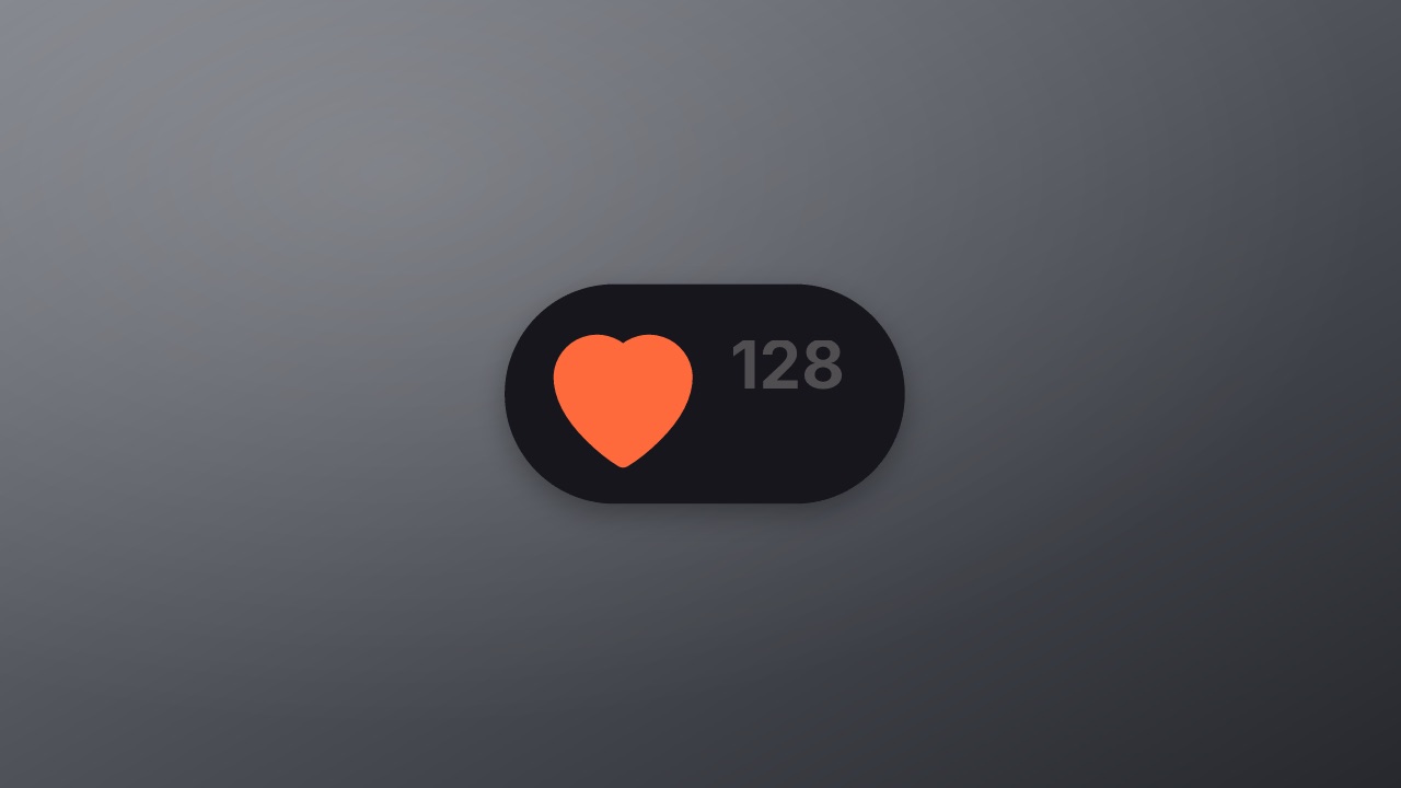
A heart and its count: it breathes while idle, pops full with a burst when liked as the count rolls up by one, and empties again when unliked. In a page, a click likes and unlikes.
ui/like- UI
- social
- Overlay with alpha
- 3.2 s (3.2–3.2 s)
Try it live
In a page it is a live element: each state plays its stretch of the timeline, and hover and click switch them. Your code sets the rest with player.state. See Interactive states.
Like
Click to like, again to unlike.
…<script type="module" src="https://cdn.jsdelivr.net/npm/volito/dist/player.js"></script>
<volito-player item="ui/like" aspect="1000x500" ground="none"></volito-player>| State | Plays | Then |
|---|---|---|
enter | once | idle |
idle | loop | stays |
like | once | stays |
unlike | once | idle |
Page events: click(idle|unlike): like; click(like): unlike
Render it
npx volito render ui/like --out like.movThat writes ProRes 4444 with alpha, ready to drop over footage. The same item in another shape, brand or format:
volito render ui/like --aspect 9:16 --style cobalt --out like-9x16.mov
volito render ui/like --format mp4 --out like.mp4
volito still ui/like --t 1.6 --out like.png
volito info ui/like     # every prop and part
volito add ui/like # copy its source into ./motion to editFrom Node:
import { findItem, renderVideo } from "volito";

await renderVideo(findItem("ui/like"), { props: {}, out: "like.mov" });Or ask an agent with the MCP server connected: “Render the Volito like (ui/like) in 9:16, in our brand.”
Props
Set each with --prop name=value, or all at once with --props and a JSON object.
| Prop | Type | Default | Takes |
|---|---|---|---|
countLikes before | number | 128 | 0 – 9999999 |
More in UI
Button
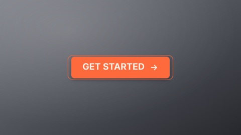
A product button with every state: it springs in, breathes while idle, lifts on hover, presses, spins while it loads and lands on a check with the done label. In a page, <volito-player> plays each state on hover and click.
Toggle
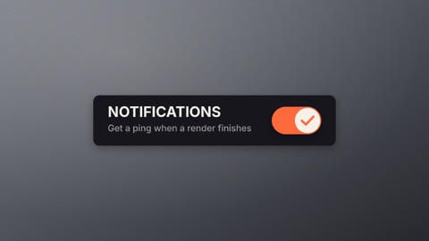
A settings switch with its label: the knob stretches as it slides, the track fills with the accent, and it slides back. In a page, a click turns it on and off.
Loader
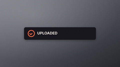
A status card that waits, then ends one of two ways: a spinner turns while the line says what is happening, then it closes into a ring with a check, or turns into a cross with a shake. In a page, your code sets the state when the work finishes.
Notification bell
A bell that rings: it swings on its hook, a badge pops in with the count, and it clears when read. In a page, hovering rings it and a click marks it read.